Have you ever considered, when inside a museum or during an art exhibition, how much the concept and technique behind the exhibition design can influence your perception of an artwork or even of the entire collection? The art critic Brian O'Doherty (1928-2022) has looked at this matter in detail.
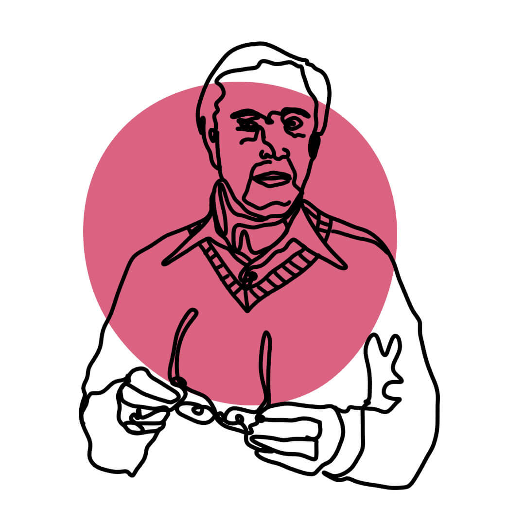
The title 'White Cube' is owed to the critic Brian O'Doherty who, in the mid-1970s, wrote a series of essays in the US magazine 'Artforum', later brought together in a single publication, entitled 'Inside the White Cube. The Ideology of the Exhibition Space', in which he presented his view on the ideal method to turn the perception of art in an exhibition effective and stimulating. The definition is perceived positively by the art system, so much so that it has become part of the critical code to indicate a new type of space for the creation and exhibition of artworks.In order to obtain a space flooded with diffuse light where the artistic creations are the focal point of the public's attention the space has to be characterised on a structural level just from a light sources from above (natural or artificial) and white-painted perimeter walls. The public itself becomes art in that sea of light and white.
According to O'Doherty, the exhibition environment must be designed "following laws as strict as those that presided over the building of churches in the Middle Ages. The outside world was not to penetrate it [...]. Art should be free to live its own life'. With this sentence, the author affirms the principles of autonomy and self-referentiality of a work of art, focusing on its spatial dimension and then going on to investigate the specificity of the places intended for art, from museums to ateliers. O'Doherty's text treats, therefore, one of the most heated debates in the history of contemporary art of the last hundred years: the one that connects the dialectic of themes and limits of representation to exhibition narratives.
The analysis starts at the end of the 19th century and goes as far as the experiments of the 1970s: to hypothesise a reconnaissance of what in the exhibition and museographic panorama preceded the attestation of the White Cube, in fact, identifies already from the end of the 19th century, in the newly conceived museum environments, a tendency towards the rarefaction of works in space. There is an attempt to implement a process of space simplification that leads to a progressive elimination of decorations considered unnecessary and, above all, distracting for the visitor. The elements that characterise this exhibition ideology are a colour scheme of the supporting perimeter walls approximating the neutrality of white, a preference given to a homogeneous type of lighting accompanied by a selection and distancing of the works according to rhythms that, while respecting the observer's point of view, emphasise the exhibition layout. One of the first cases taken as an example that best expresses this new way of exhibiting artworks is Joseph-Maria Olbrich's Viennese Secession pavilion, built in six months during 1899; white, high and spacious rooms are characterized by diffuse lighting: all aspects suited to the harmonious coexistence of different types of works.
In the 1920s and 1930s, then, considered to be a flourishing period for new experiments in the specific field of "exhibition scenography", when "museums were important not only for their increasing role in supporting and validating developments in contemporary art by setting it narratively in an art-historical course, but also for the conception of new exhibition strategies", a significant approximation to the logic of the White Cube occurred. The new museums for art adopt different layouts as an alternative to the 'promiscuity' already perceived with annoyance around the middle of the 19th century: the architecture of the modern museum has to renounce vain decoration, since it is the works of art themselves that adorn the museum and an impression of greater order and harmony has to be restored to the visitor.
The spread of a specific consensus linked to the White Cube is found not only in European contexts, but also overseas, particularly in New York City, which is more prone to processes of resetting and recurring 'rites of refoundation'. This consolidation was made possible in particular during the 1970s thanks to a massive emigration to southern Manhattan (Soho) of artists of the minimalist current who, in search of more suitable (and inexpensive) studios, moved into pre-existing light-industrial buildings, characterised by spacious rooms without partition walls, cast-iron structural elements and large windows, created to be purely functional and not adorned with attractive decorations.
The roots of this close dialogue between new aesthetic instances, ateliers and exhibition spaces, which are believed to have given rise to the codified form of the White Cube (and which partly explain its typological persistence), can also be found in that reduction of the work of art to pure structural components and the use of industrial production techniques that had already belonged to the experimentation of the Russian avant-gardes. Therefore, the assonance between Kazimir Malevič's White Square on a White Background (1917), both with the sign of the primordial ideality of the White Cube, and with Minimalism is inevitable: in each of these visions, the suggestion generated by white, which certainly contributes to the definition of pure abstraction, allows the elimination of all sensorial stimuli, placing the spectator in front of the work of art in a condition of the most disinterested judgement possible.
From a spatial point of view, since the White Cube is not only or simply a physical environment, its persistence and pervasiveness lies precisely in its constituting itself as a "symbolic form" of the art of the last century; where the Renaissance perspective and its rigid geometric structure (often dictated by physical architectural limits), which imposes the physical centrality of the observer in the distance, is put before the potential of a mental space generated by the works in the mind and creativity of the public.
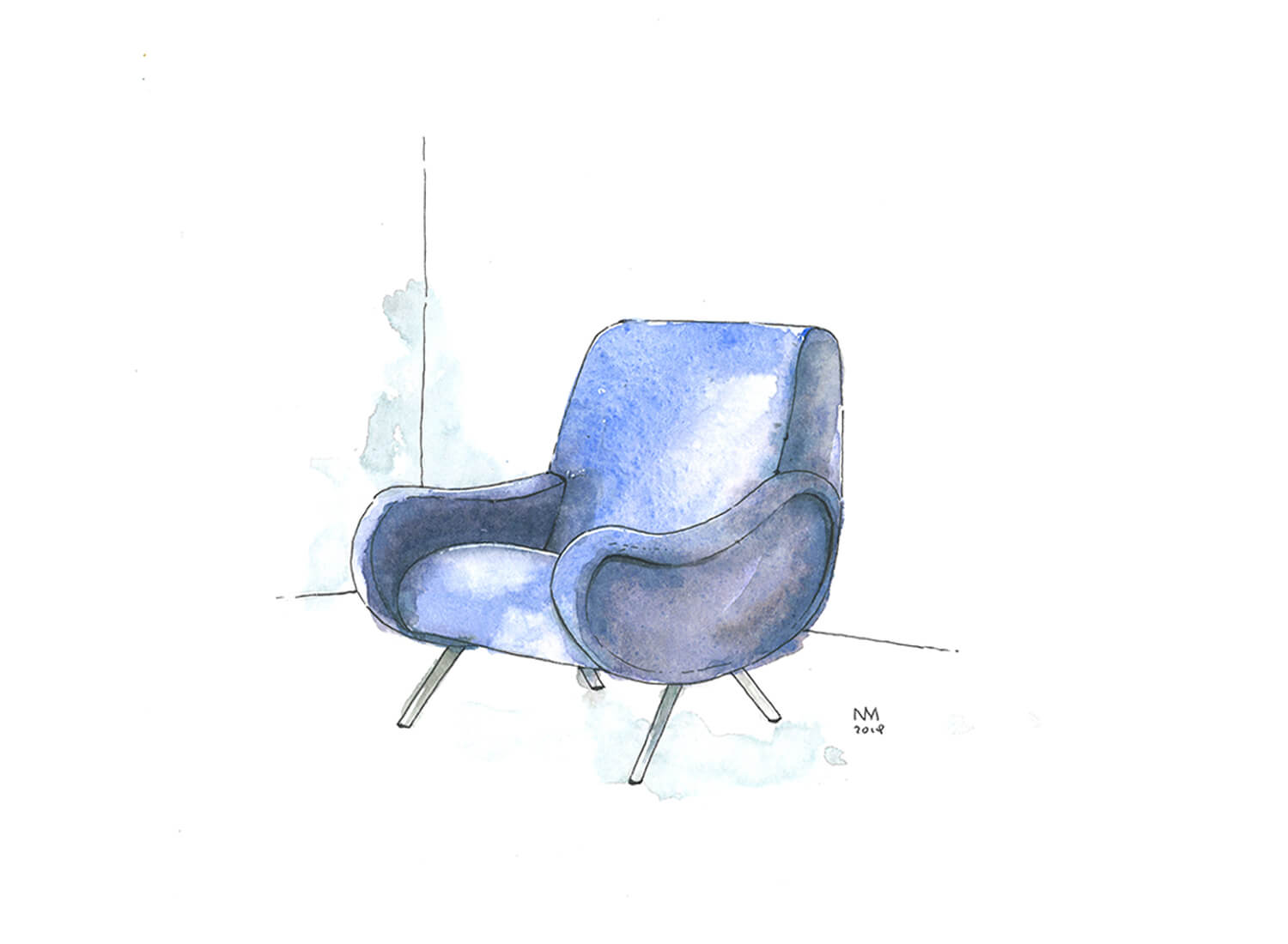
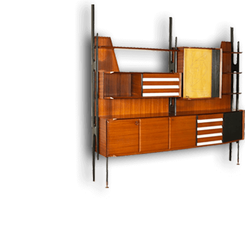
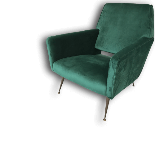
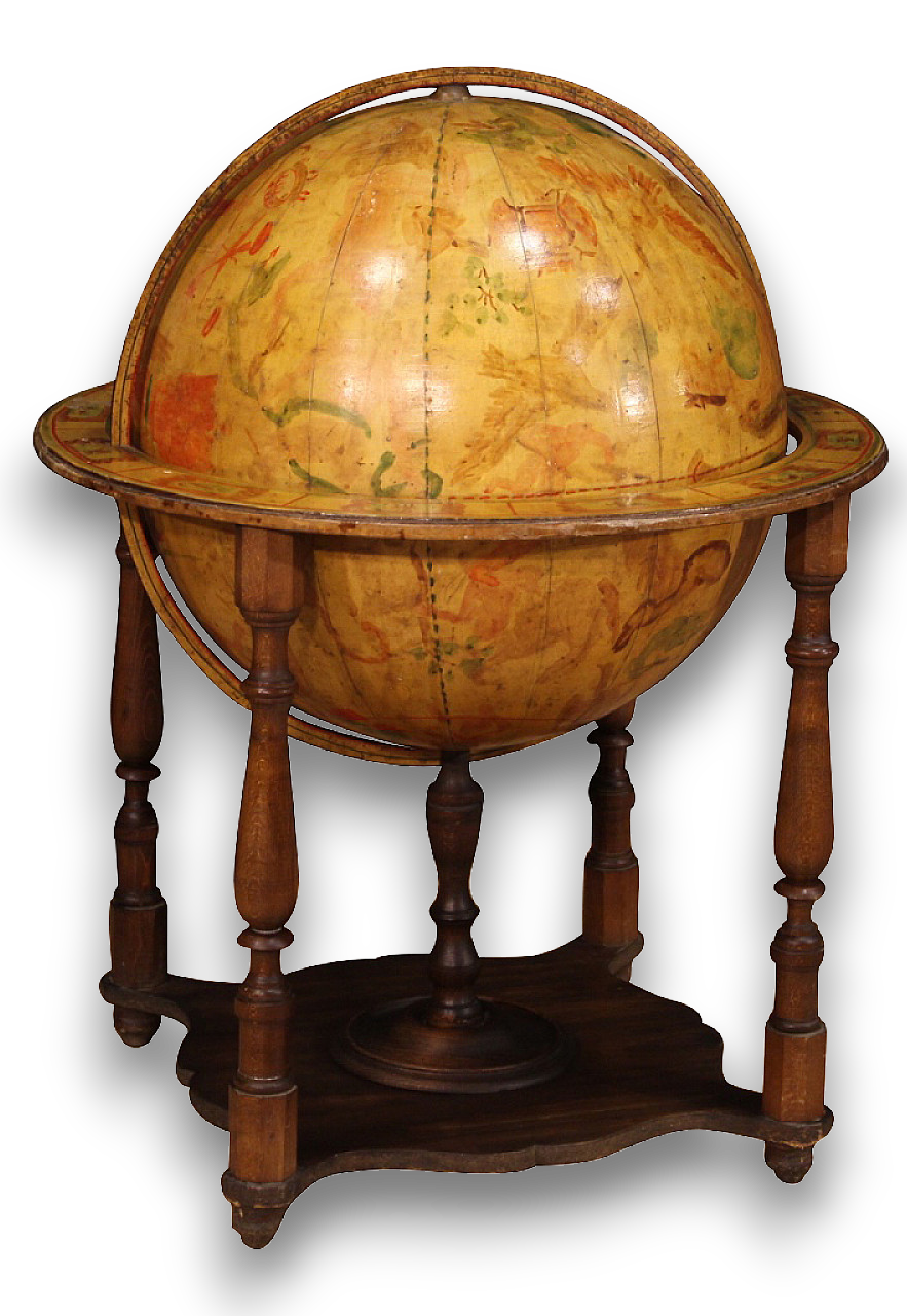
O'Doherty's ideas are still shared and held in high estimation by many people, due to the strength and credit they have earned over the years, but there is often an attempt to turn a visit to an exhibition space into a more cosy and enjoyable experience: a few carefully selected pieces of furniture with a vintage touch (low sideboards, armchairs from the 1970s, coffee tables, small decorative objects...) appear in the exhibition settings (especially in contemporary art and fairs), making the space more welcoming and encouraging the visitor to live a complete immersion in art.


.png)
